PROBLEM
Duration: 9 Weeks
Team: Aliyah Baruso, Liam Stone
Opulence is conference focused on uplifting members of the Drag And Ballroom community. My partner and I recognized several core problem spaces we could respond to with our conference: lack of attribution to drag queens for their art, lack of accessibility for newer queens affording drag resources, and lack of awareness for those outside of the drag community. With this, we embarked on a journey to create a visual system for such a conference.

PROCESS
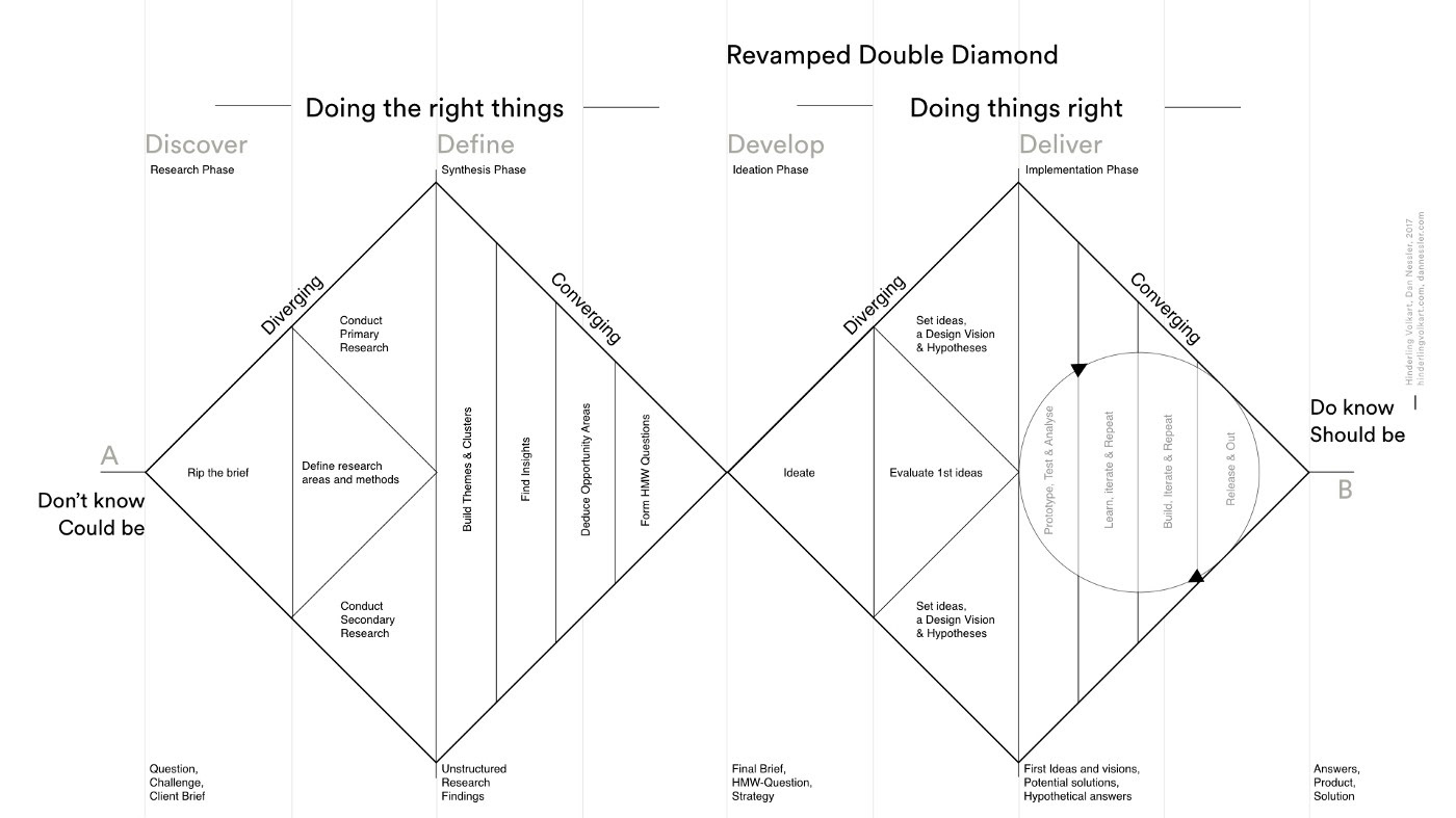
REsearch
We were tasked with creating a conference within the industry vertical of Arts & Culture – with a positive twist. My fellow classmates and I created a definition for Arts & Culture as follows: "The creative disciplines shared by a certain social group including visual, literary, and performing arts." We then researched a variety of brands and other conferences within the same industry vertical of Arts & Culture. This competitive review revealed a variety of competitors from venues, music festivals, fashion magazines, design podcasts, and dance events. My partner and then produced a list of ideas for conference topics to competes in this space. Ideas included conferences for drag & ballroom, bio-art, multicultural arts, wiccan arts, and many more. We ended up choosing to pursue creating conference surrounding drag & ballroom culture for its numerous aesthetic possibilities, importance and positive impact, and its ability to excite us the most.

Synthesis
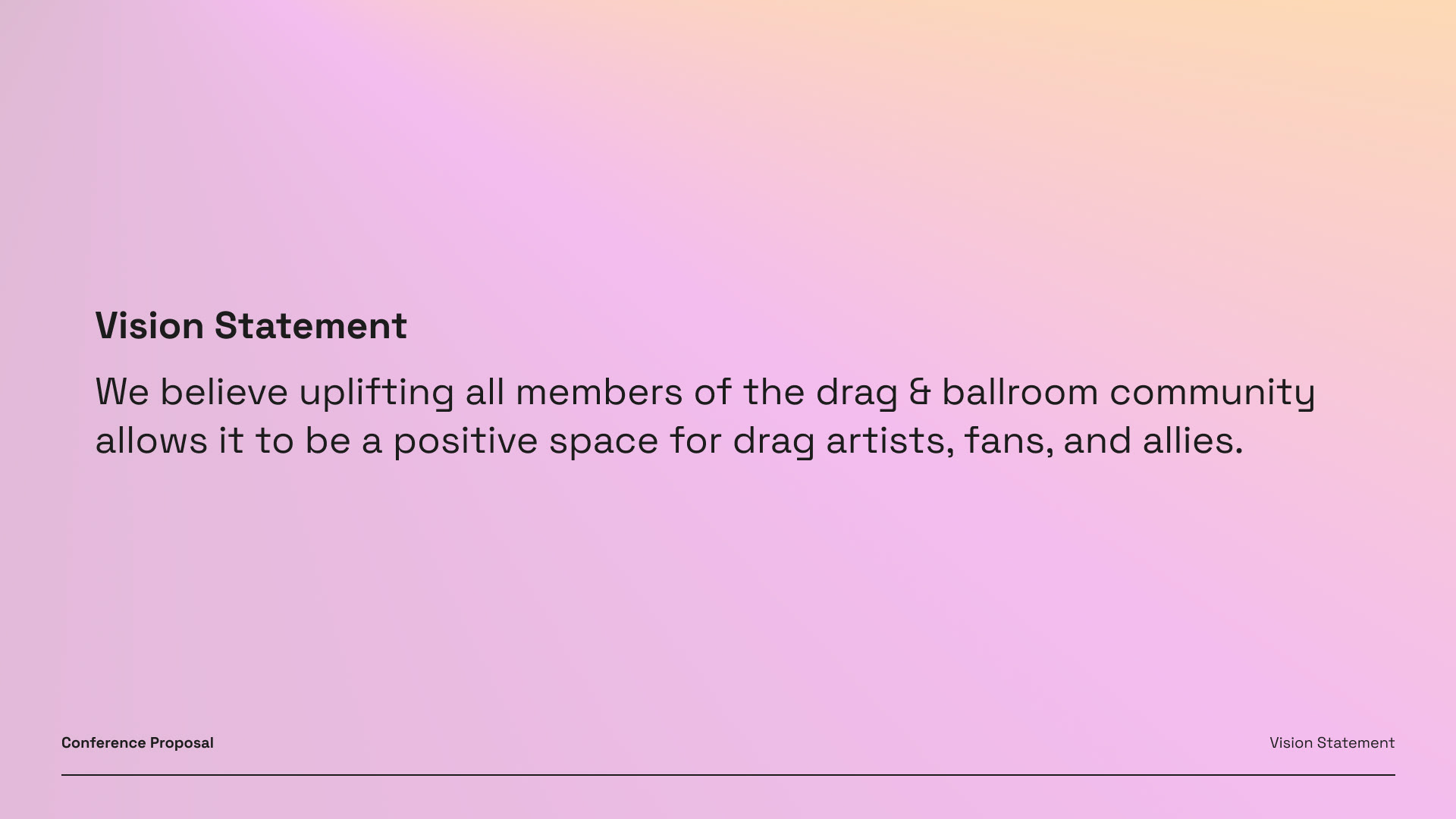
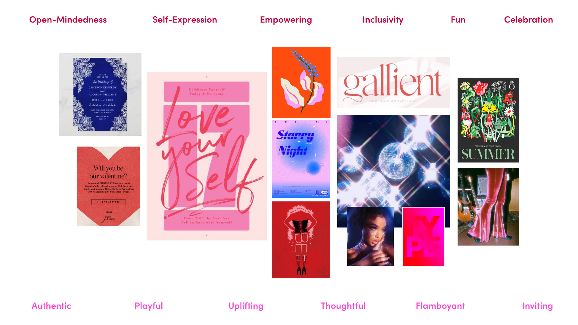
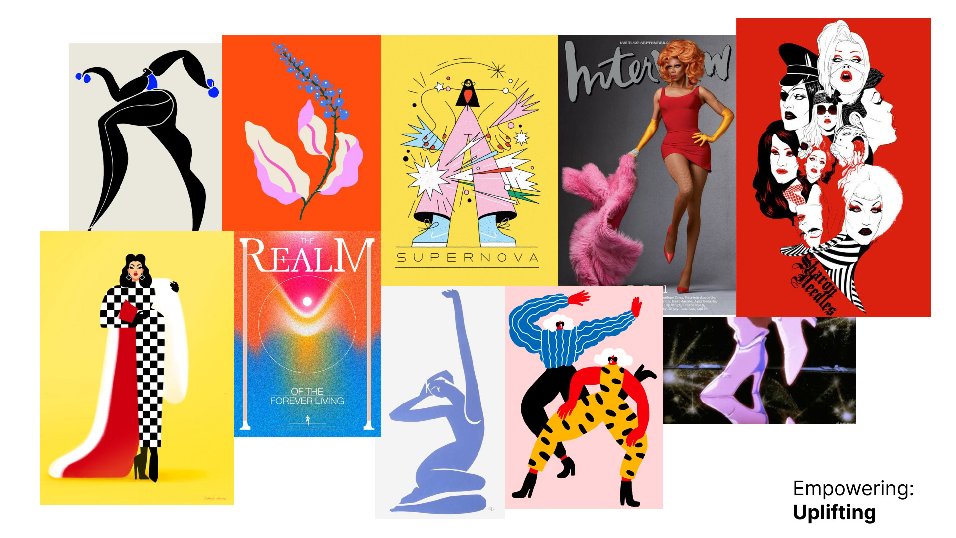
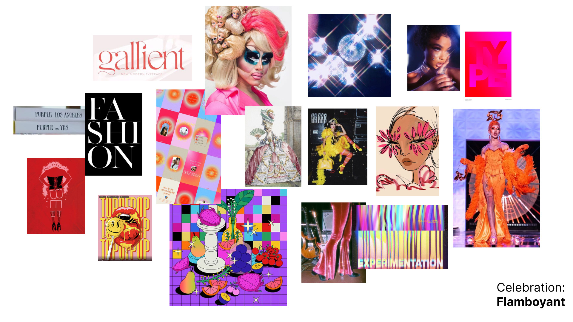
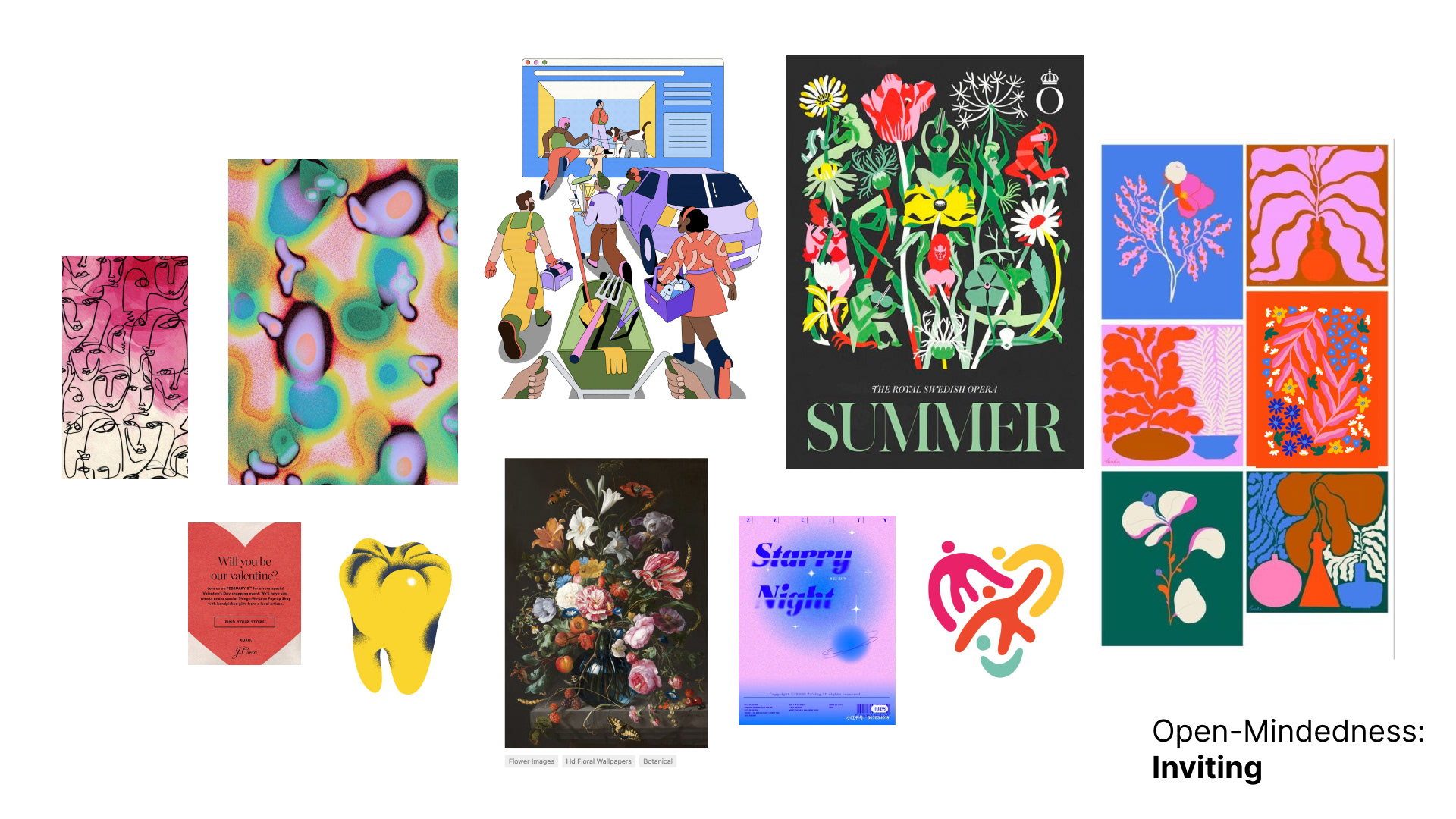
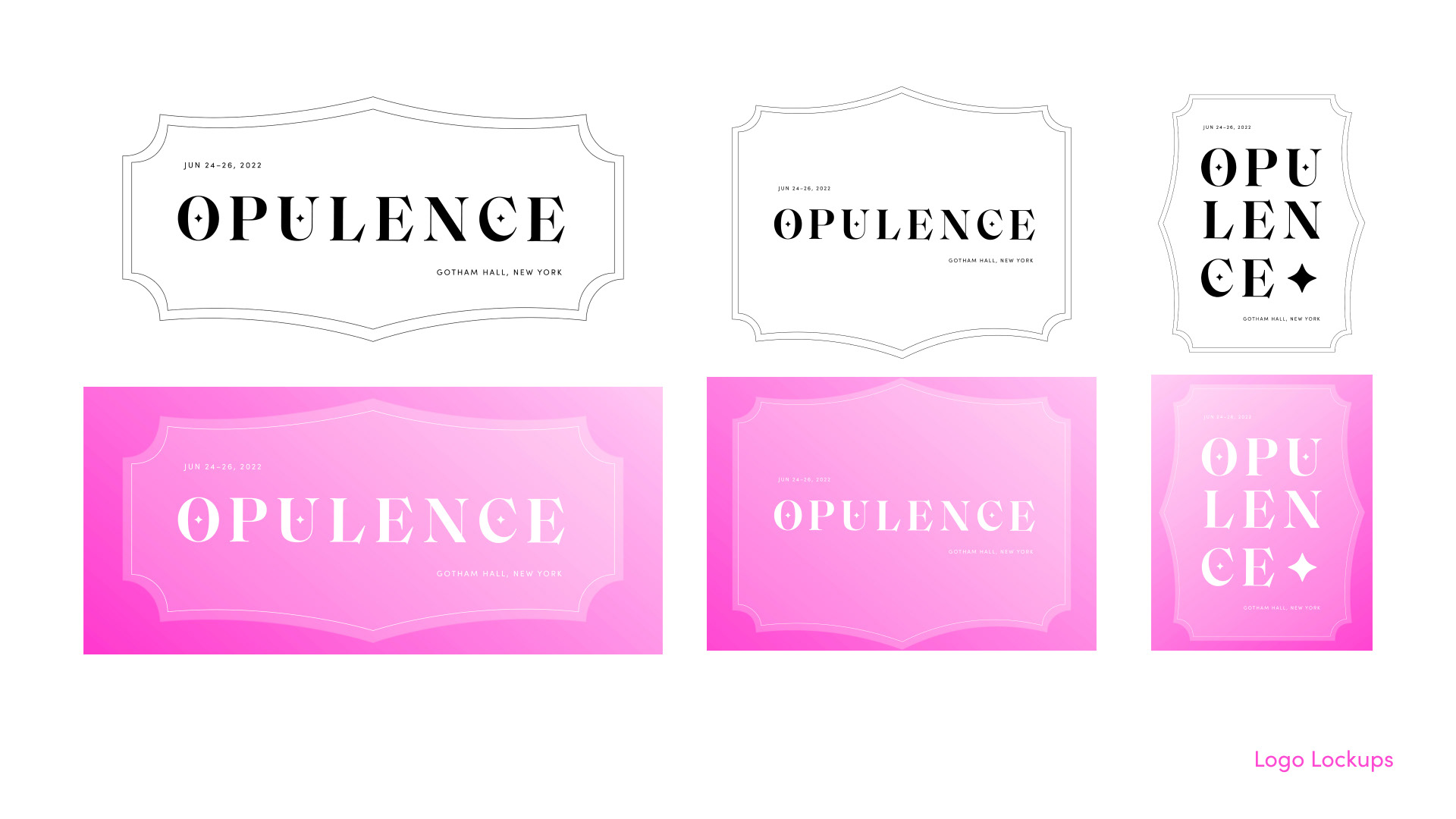
My partner and I created a vision statement as follows: "We believe uplifting all members of the drag & ballroom community allows it to become a positive space for drag artists, fans, and allies." For this vision statement to be sincere, we decided that the values of open-mindedness, inclusivity, self-expression, empowerment, fun, and celebration are important. Then we came up with the following personality traits: inviting, thoughtful, authentic, uplifting, playful, and flamboyant. Using these guiding traits in the context of drag culture, we widened on exploration on Pinterest, Behance, and other internet resources to gather visual references of a wide variety that fit these values. We then created specific mood boards to narrow in on a visual style. We then widened our ideation again using these mood boards as reference to create our first visual ideas: the logo lockup. We presented six variations and gathered critique to come to consensus on one idea to pursue.


IDEATION
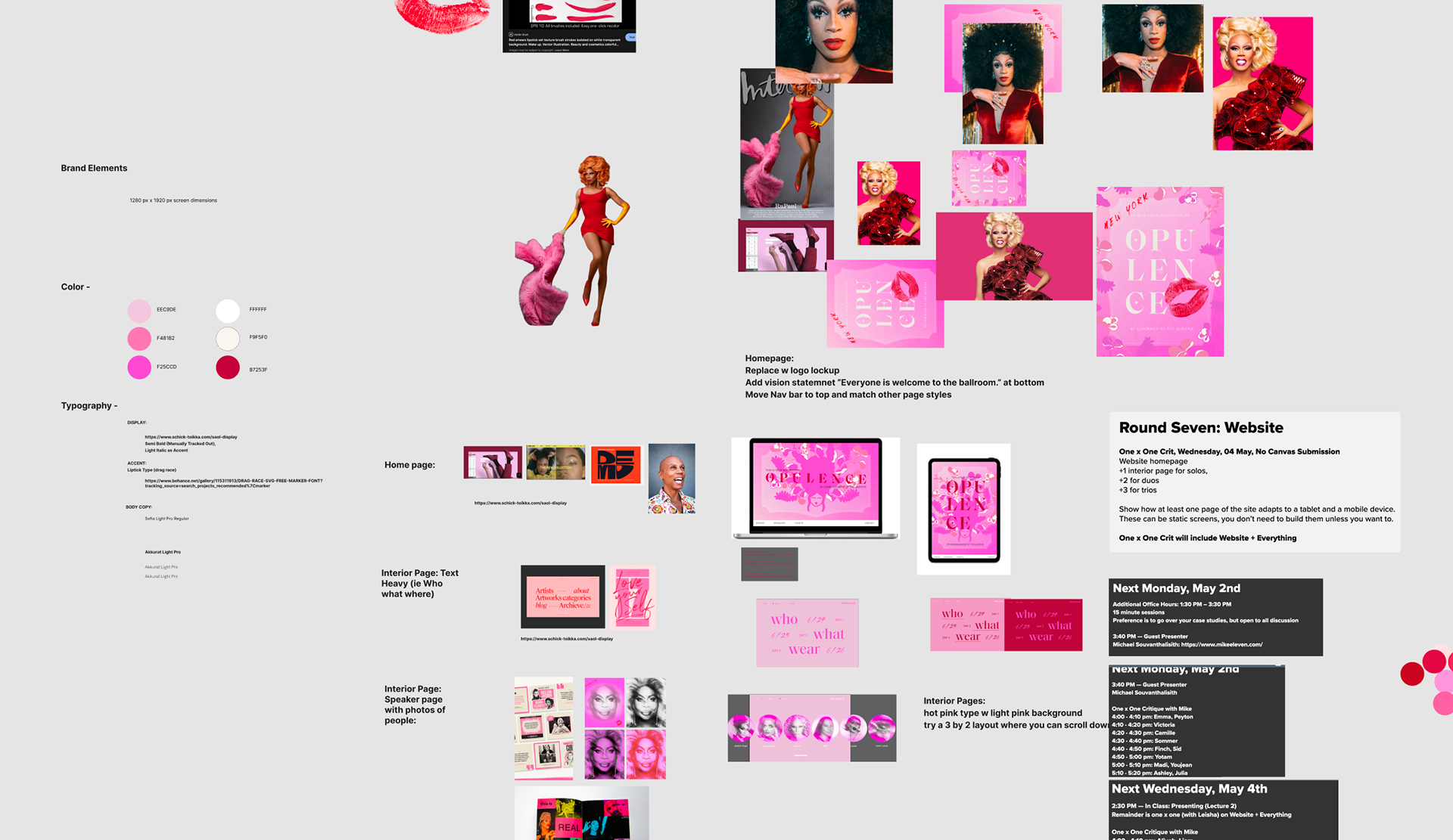
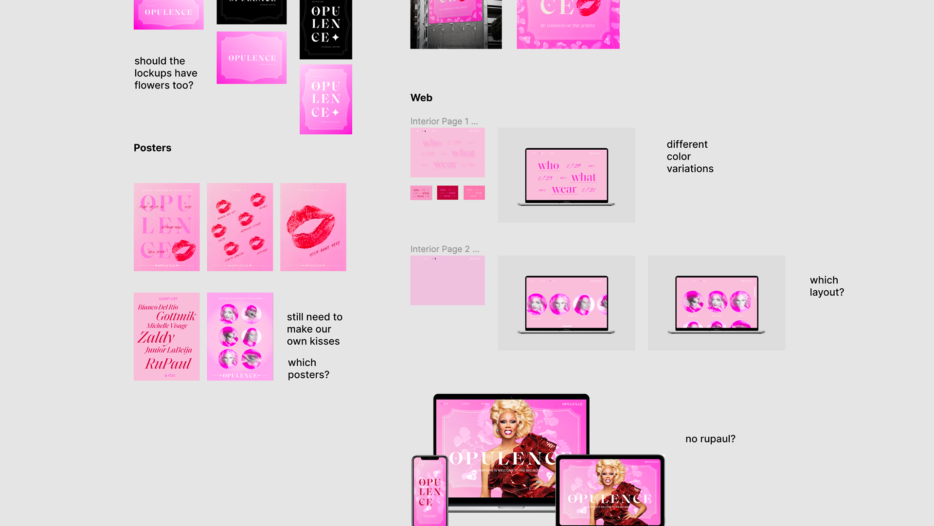
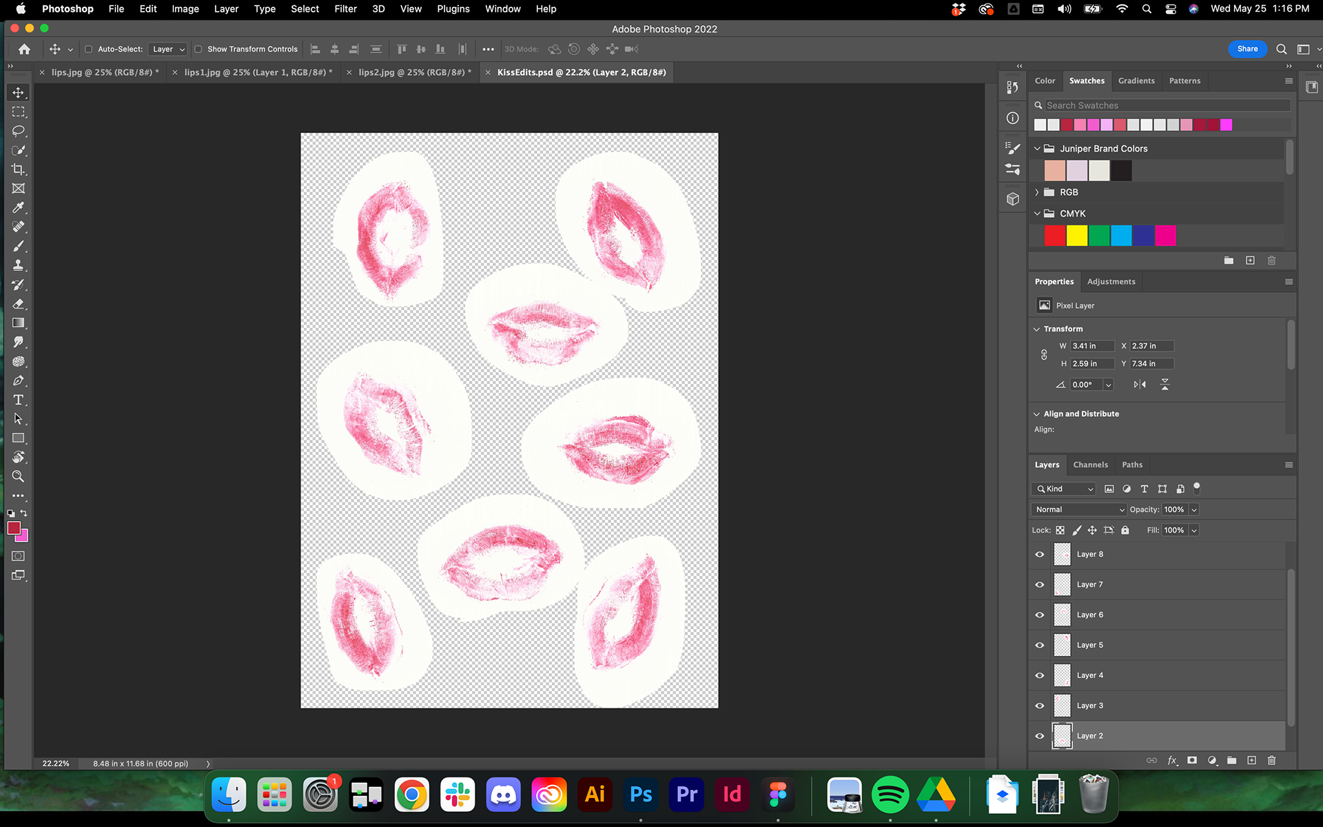
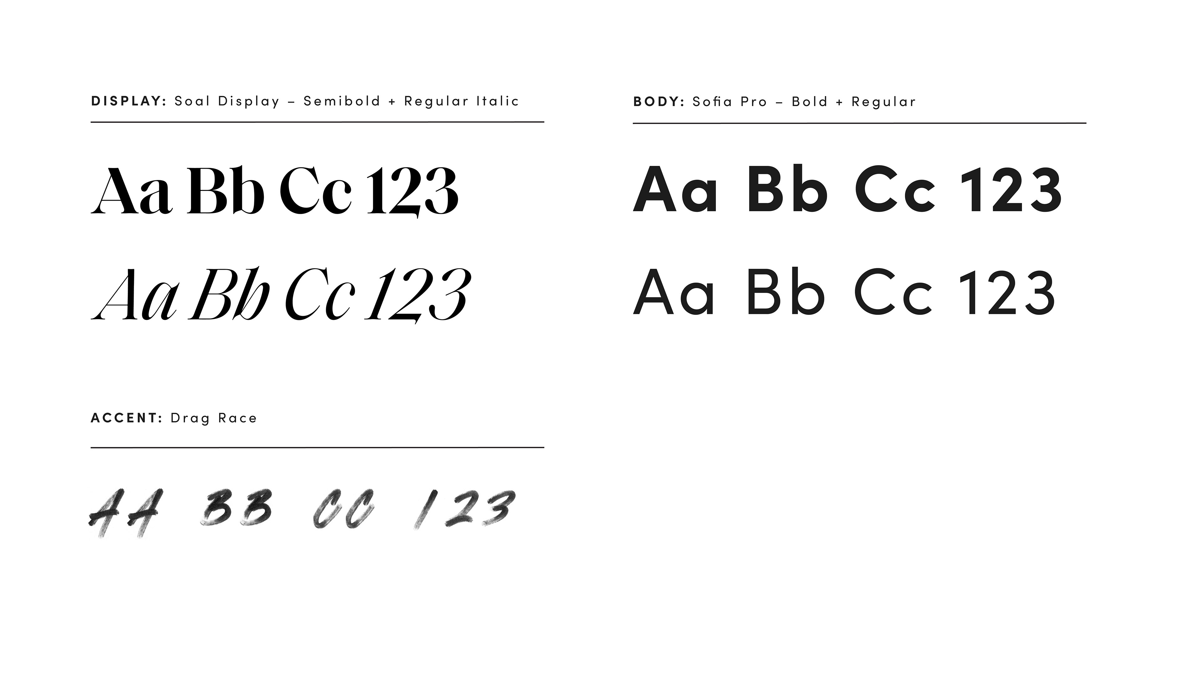
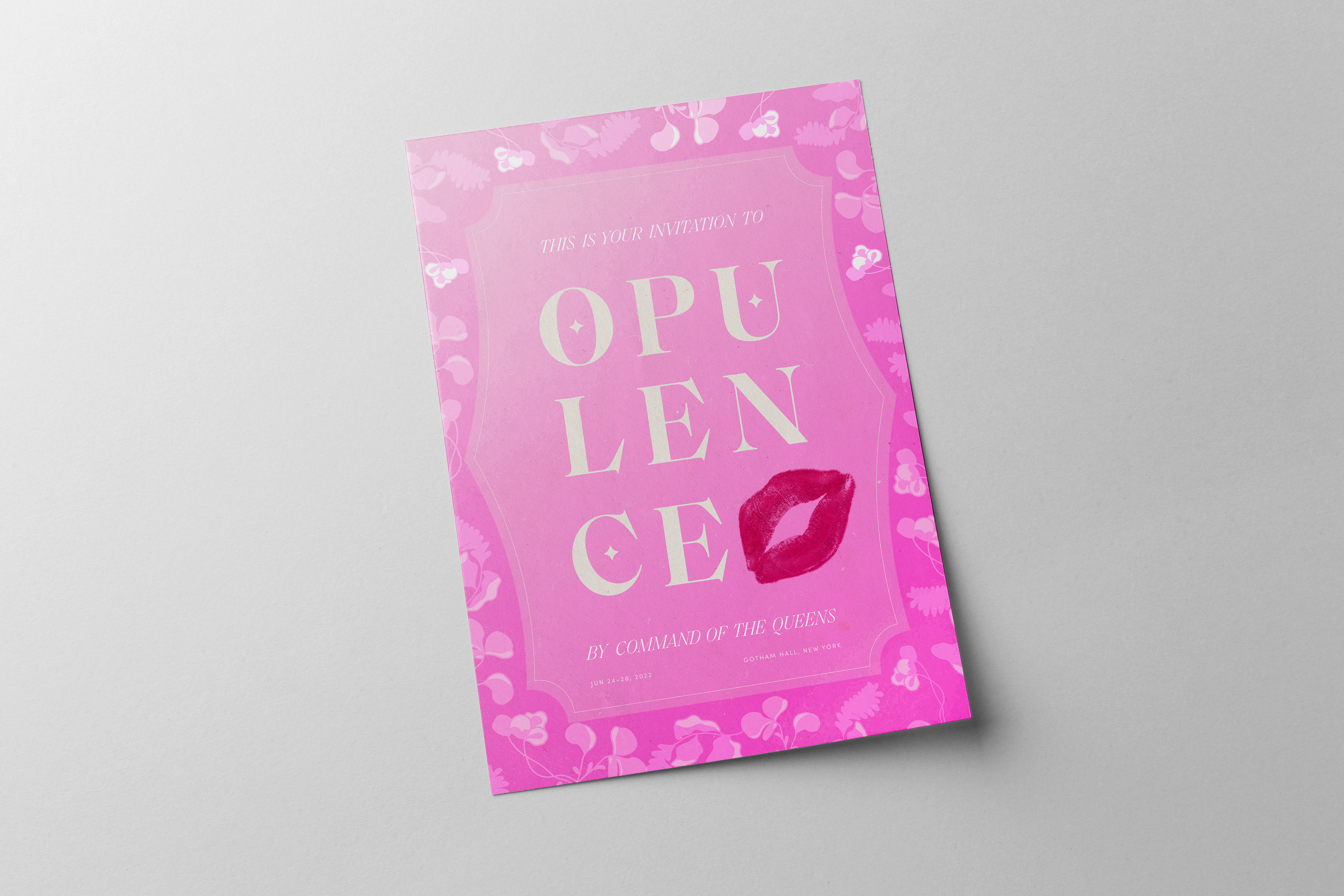
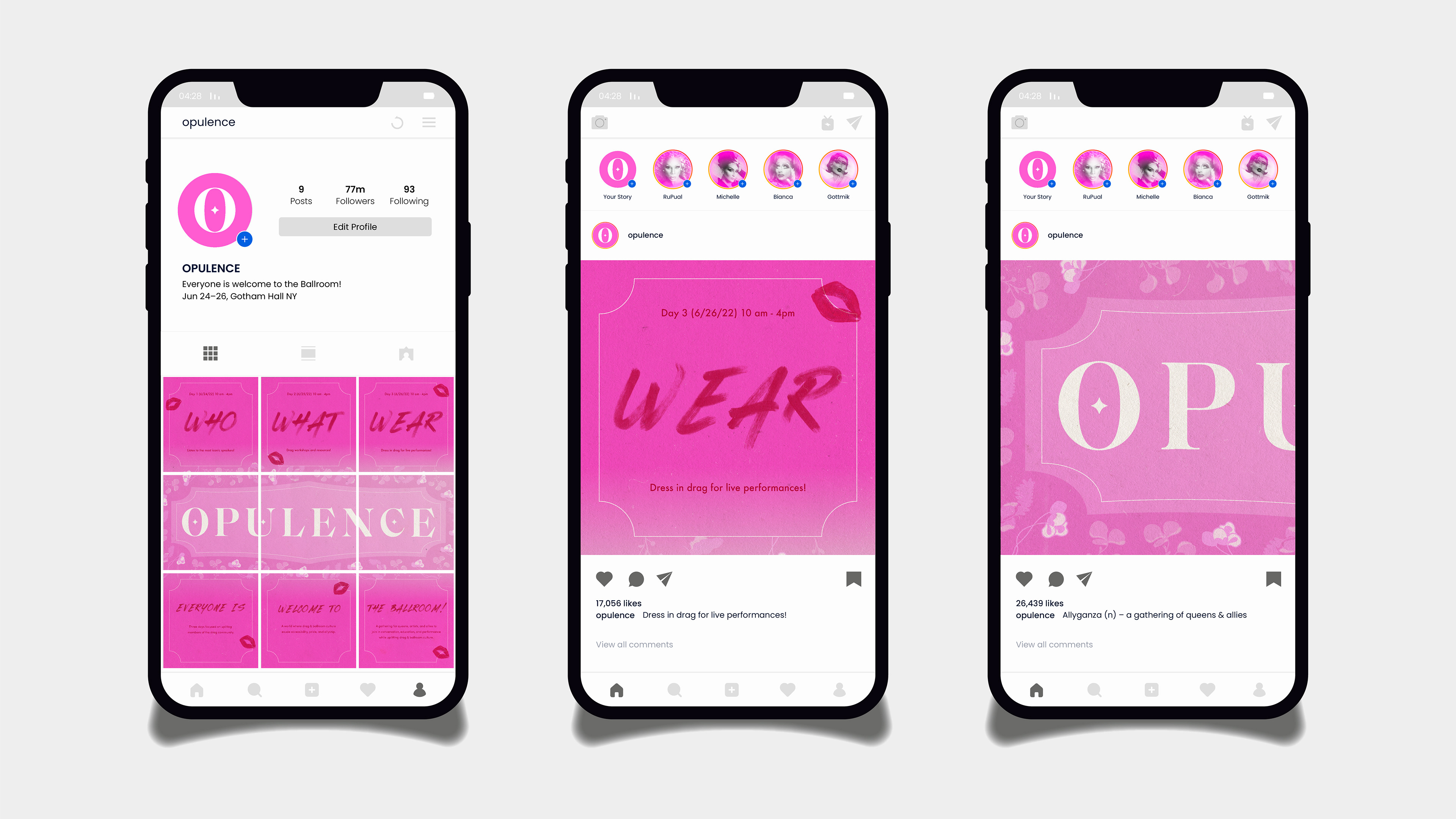
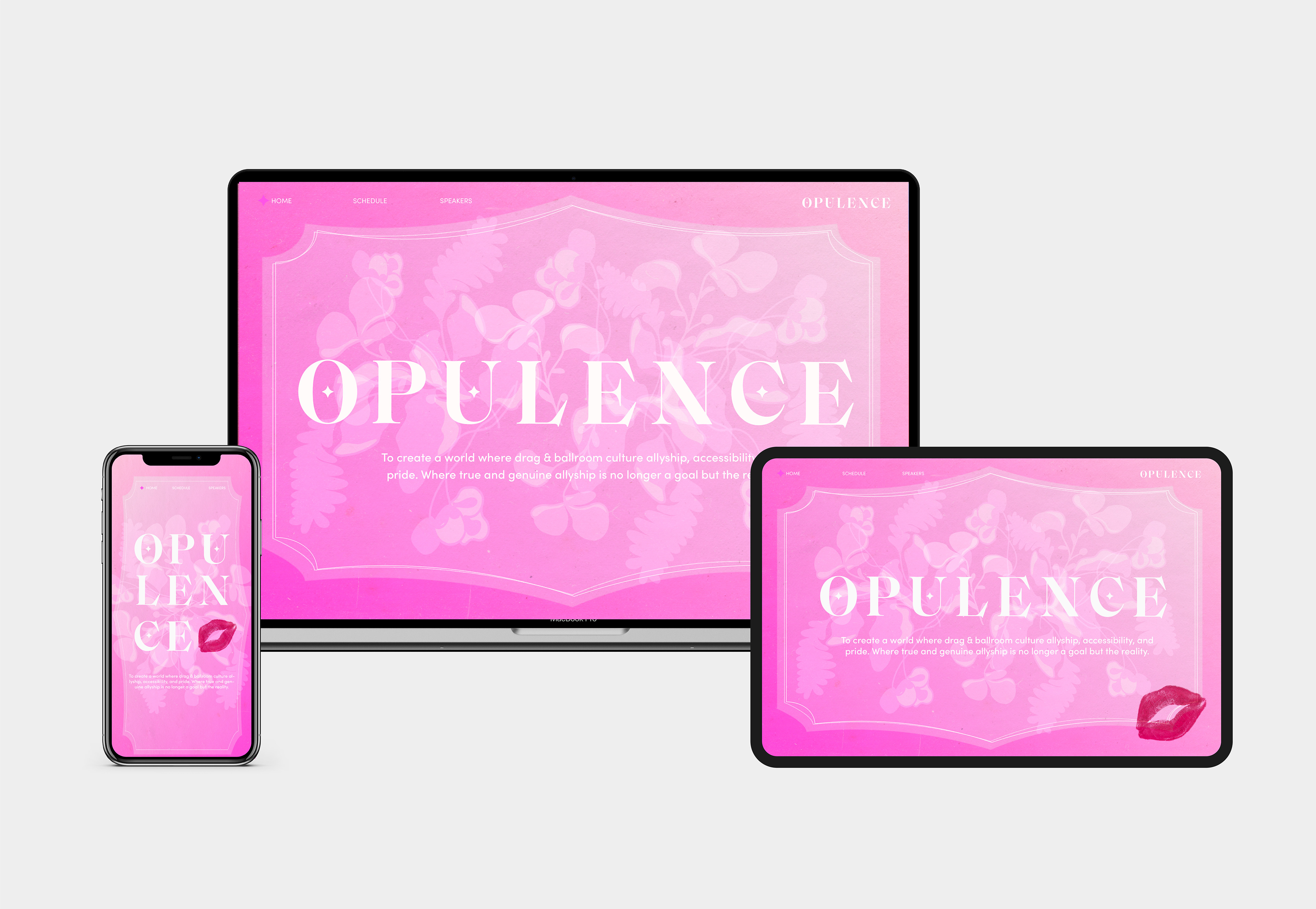
The ideation phase was a process that widened our scope, and then we had to revise and narrow our scope back down accordingly. At this point in the process, my partner and I need to keep pushing forward with new assets while revising old ones. The color palette is working well because it conveys the personality and values of the conference and allows for a variety of color combinations. The type system is also working well for all applications including print and web applications. The web design and motion pieces both use these elements effectively. The posters need refinement at this phase. The mockups need the most refinement at this phase. The colors and elements aren’t translating super effectively at this stage to our makeup mockups and pop up shop mockups. This may require going back and reevaluating our visual system slightly.


Implementation
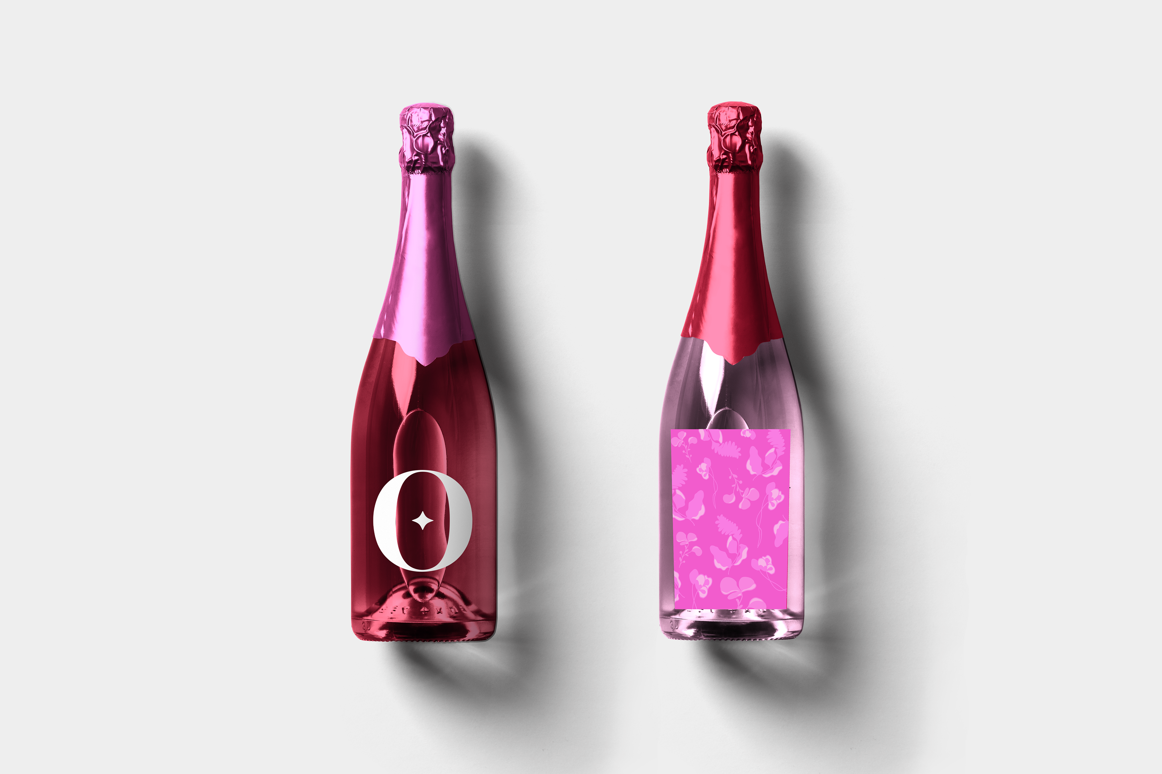
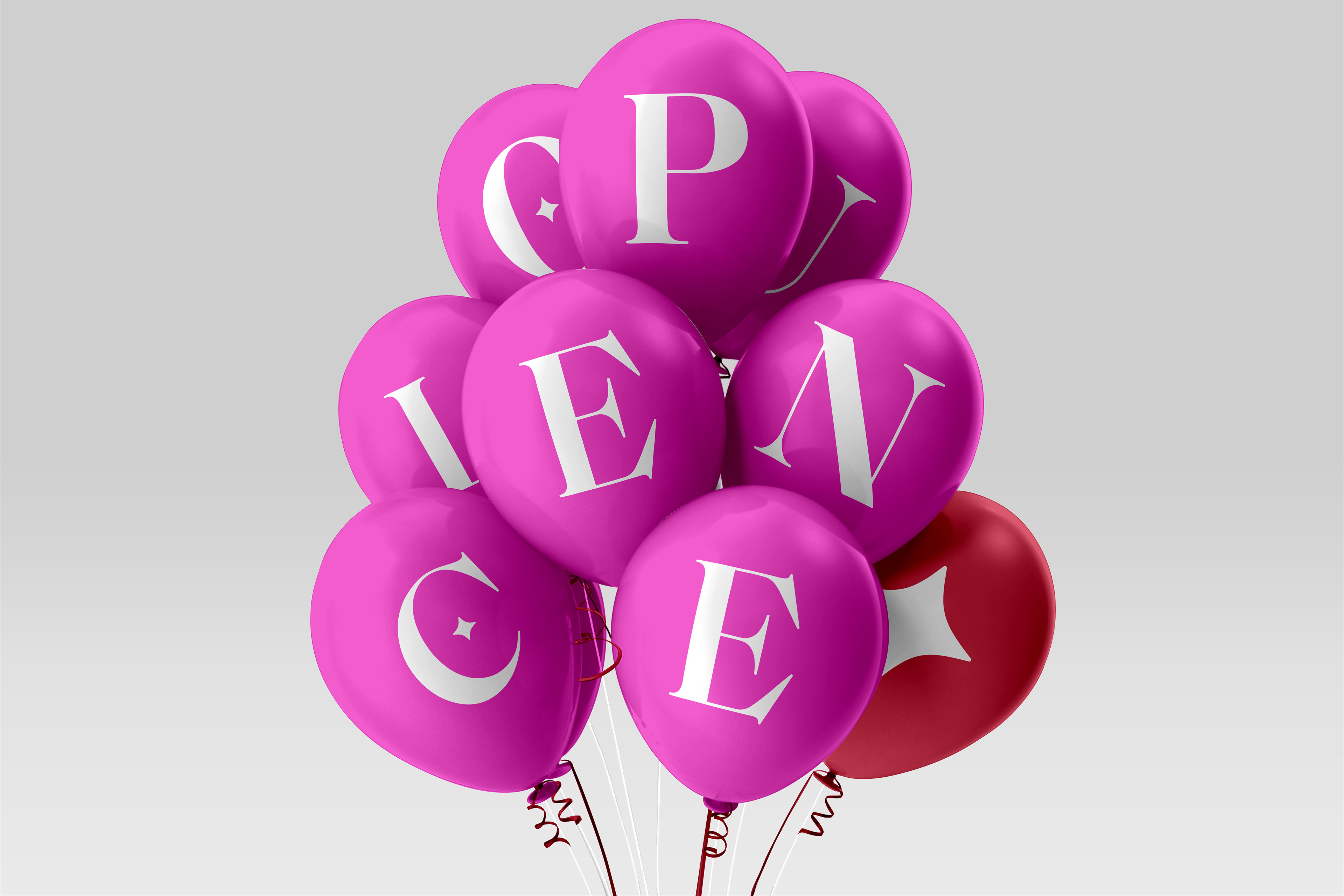
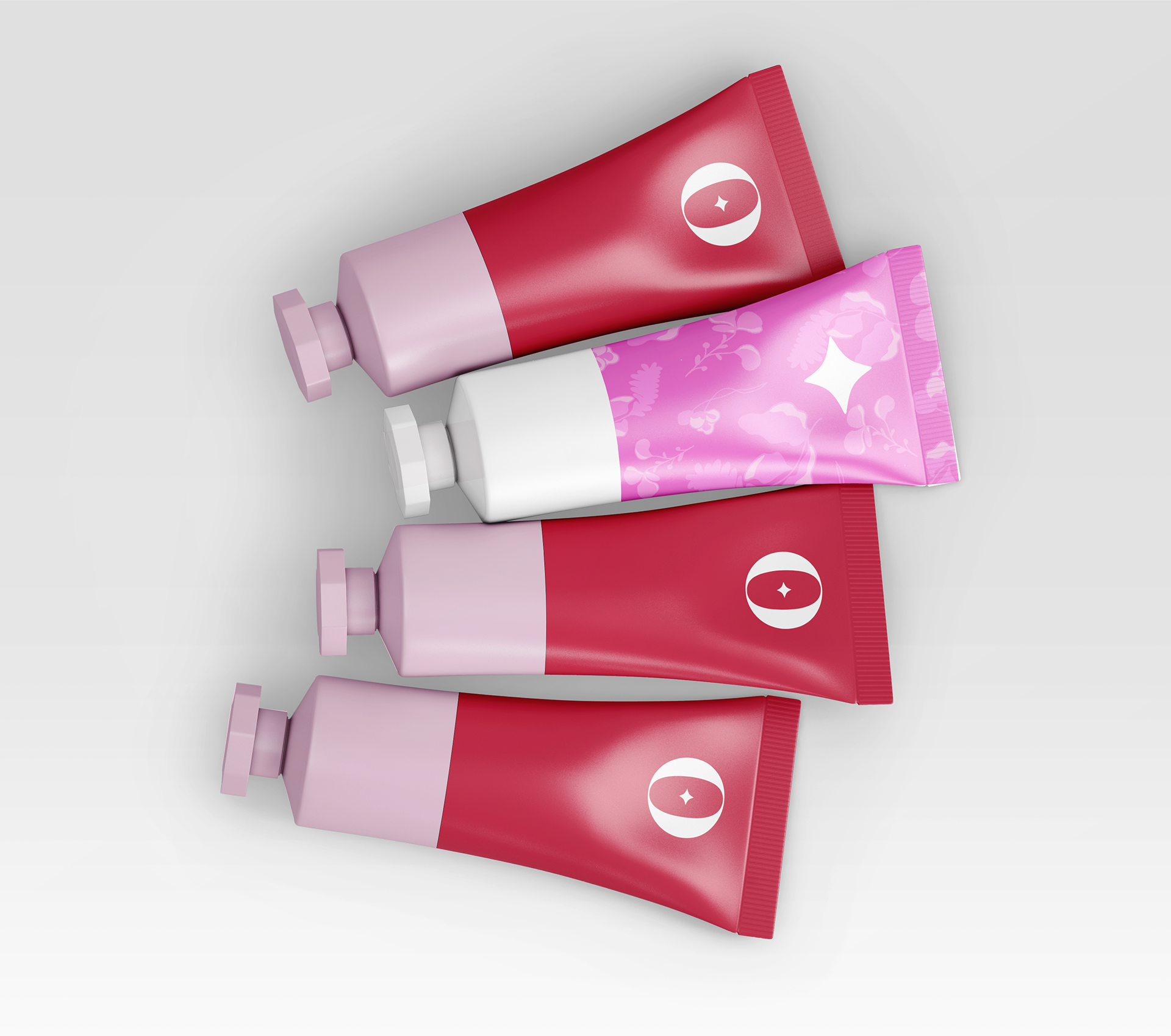
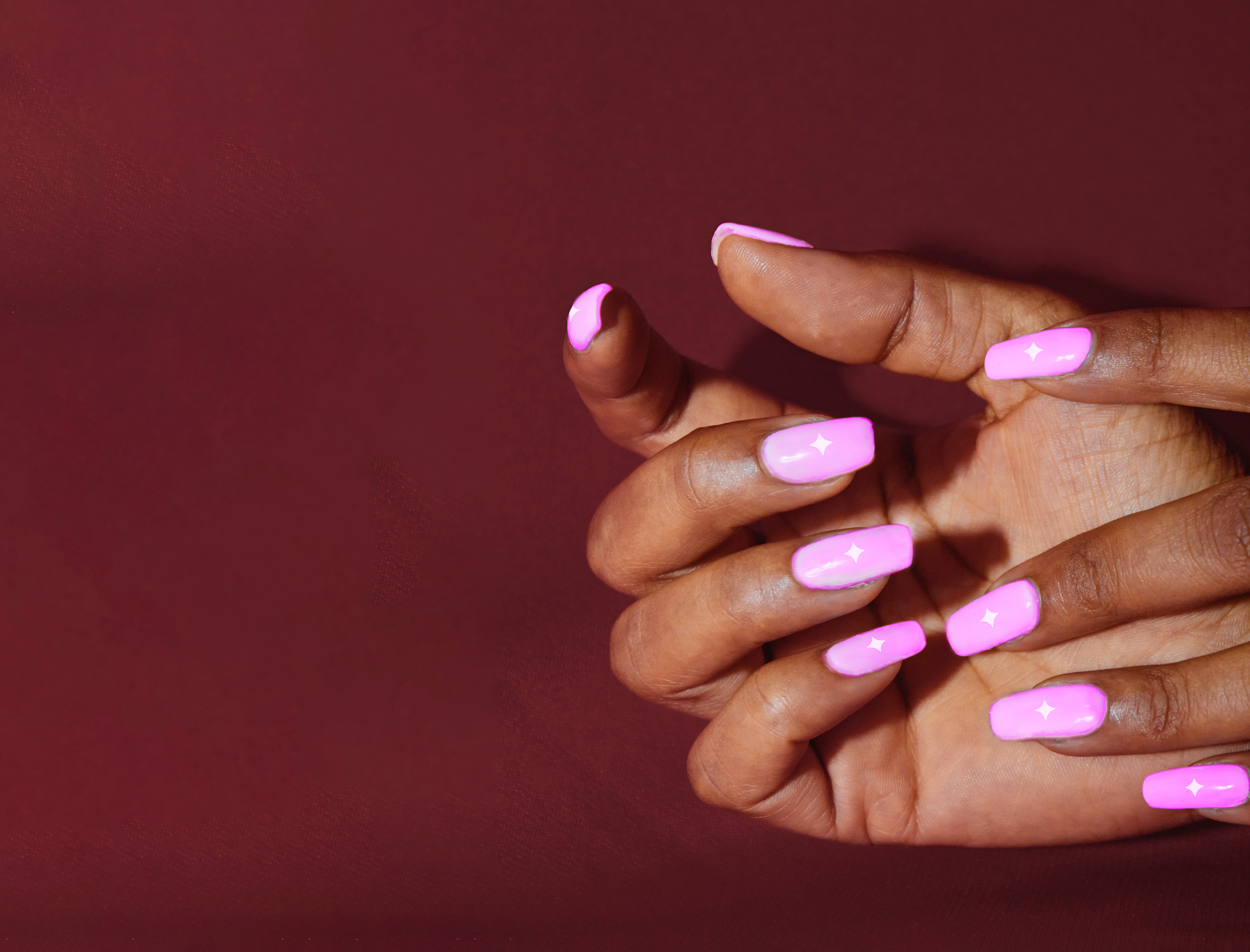
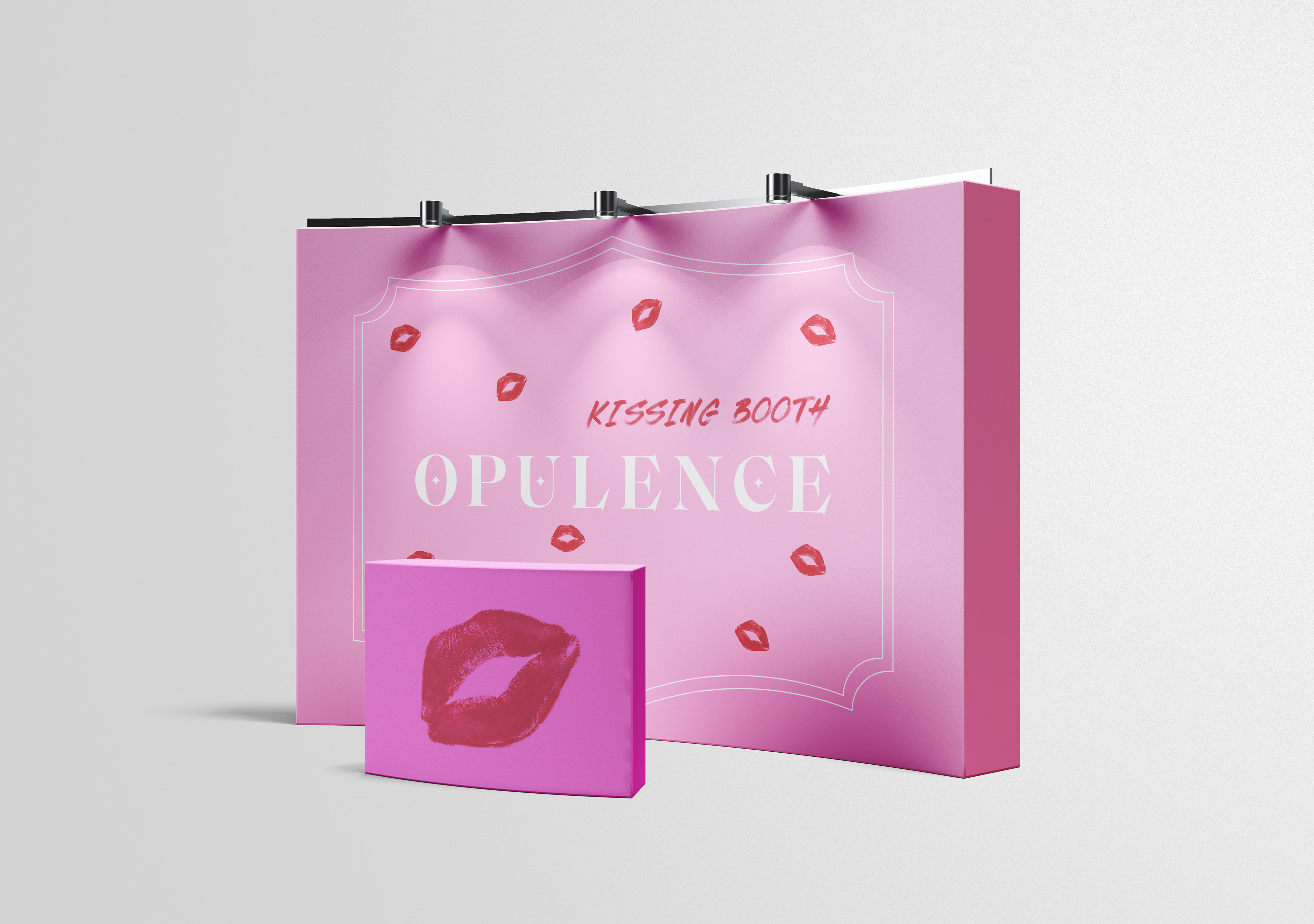
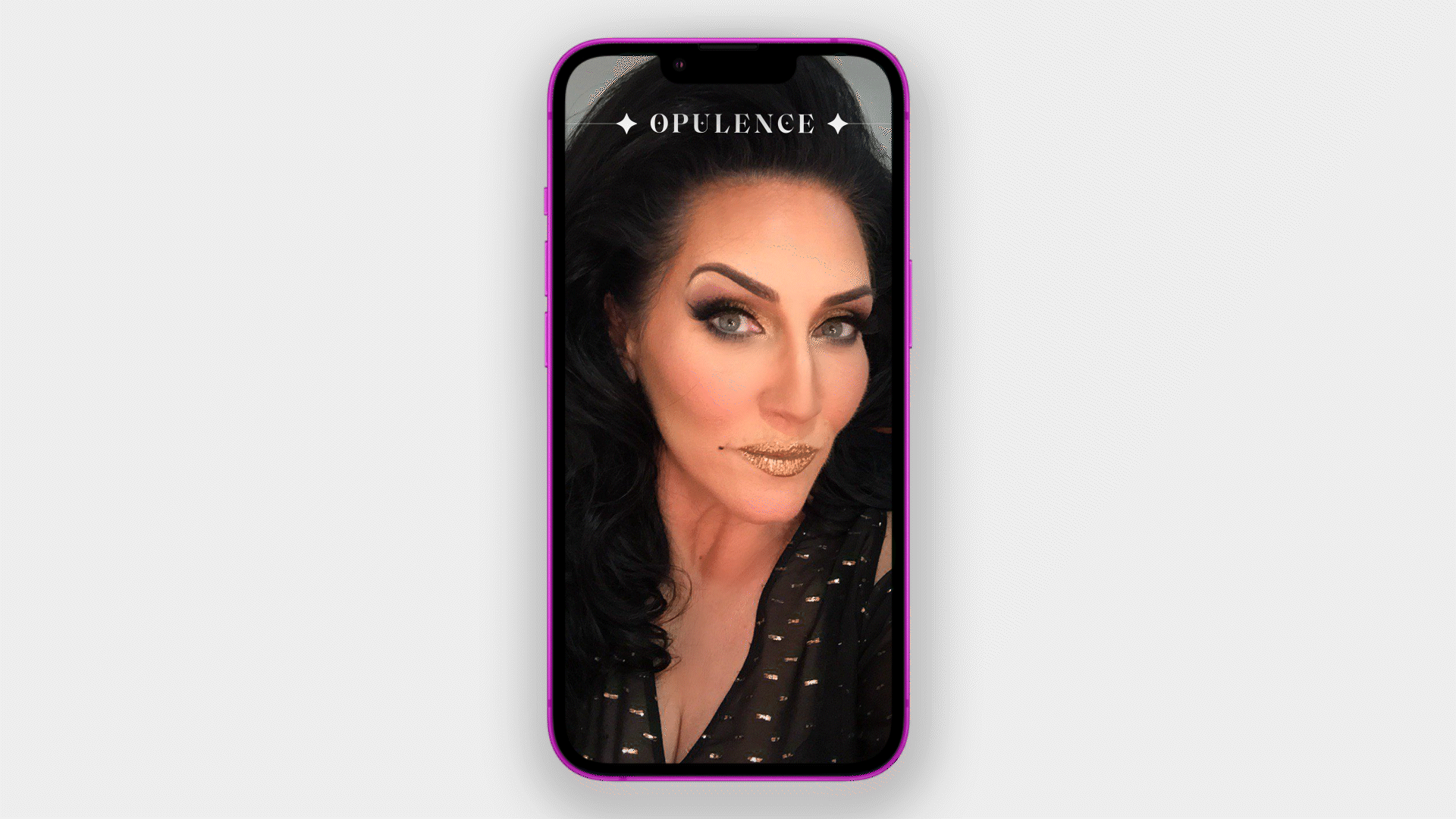
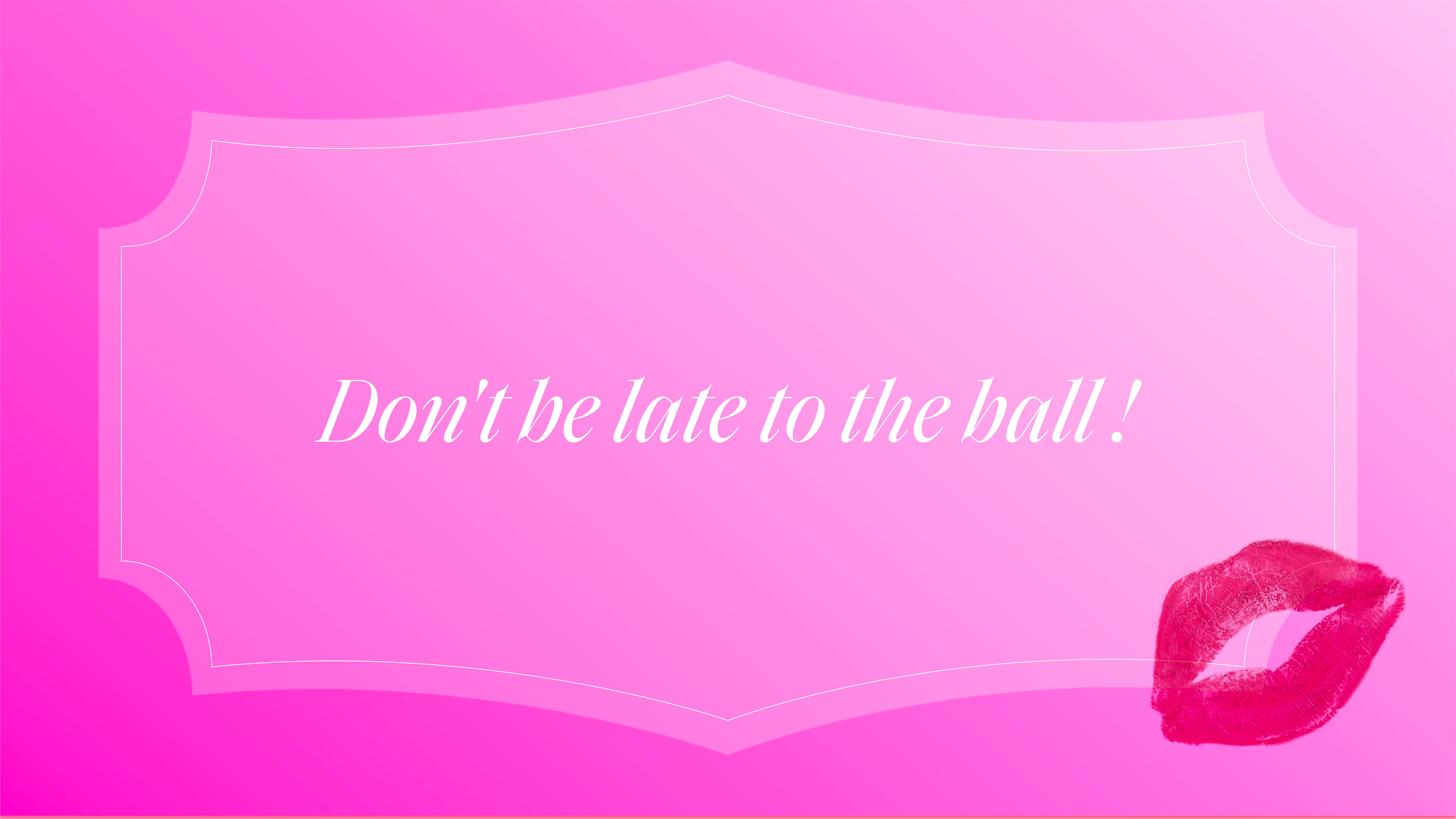
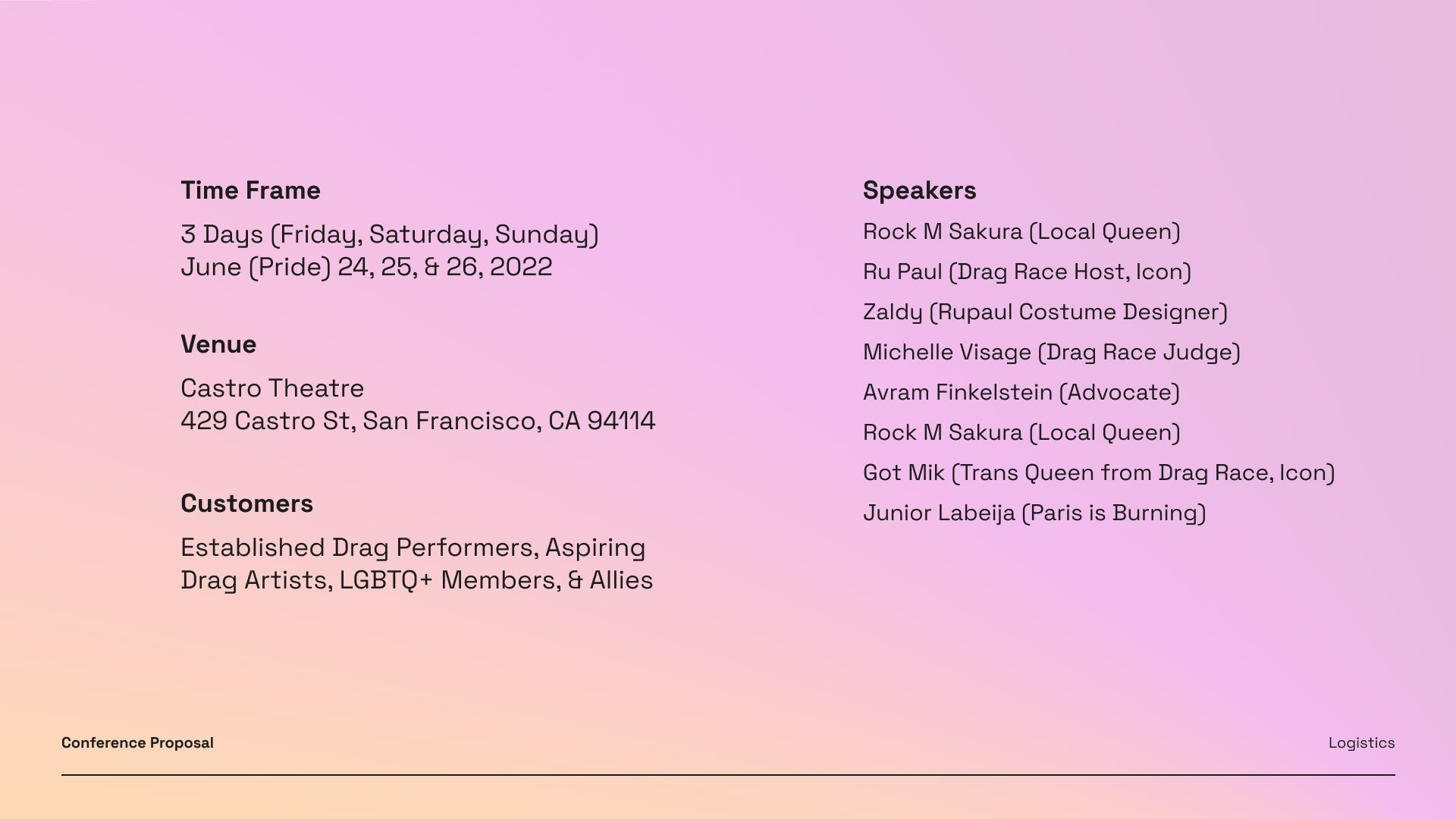
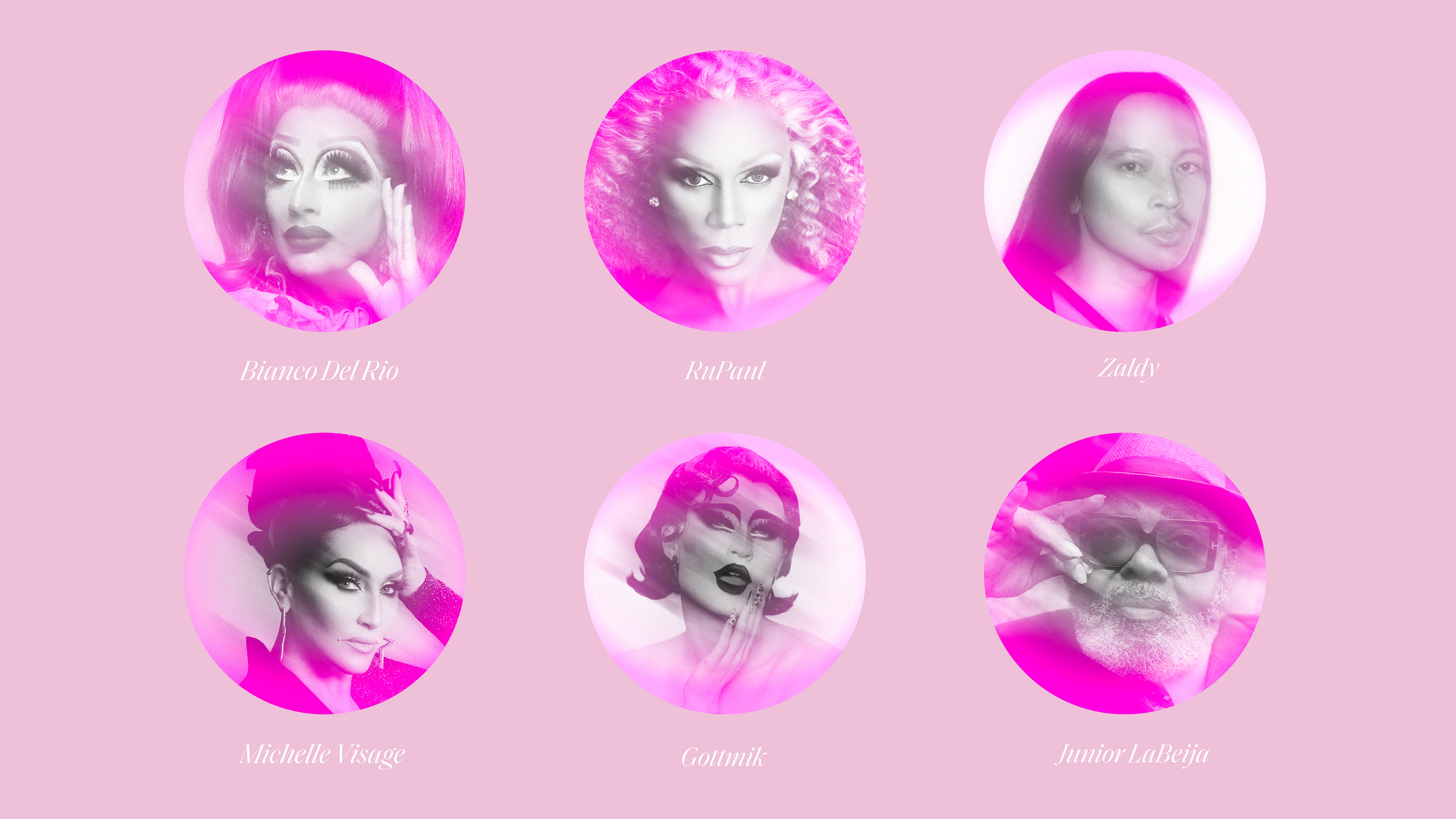
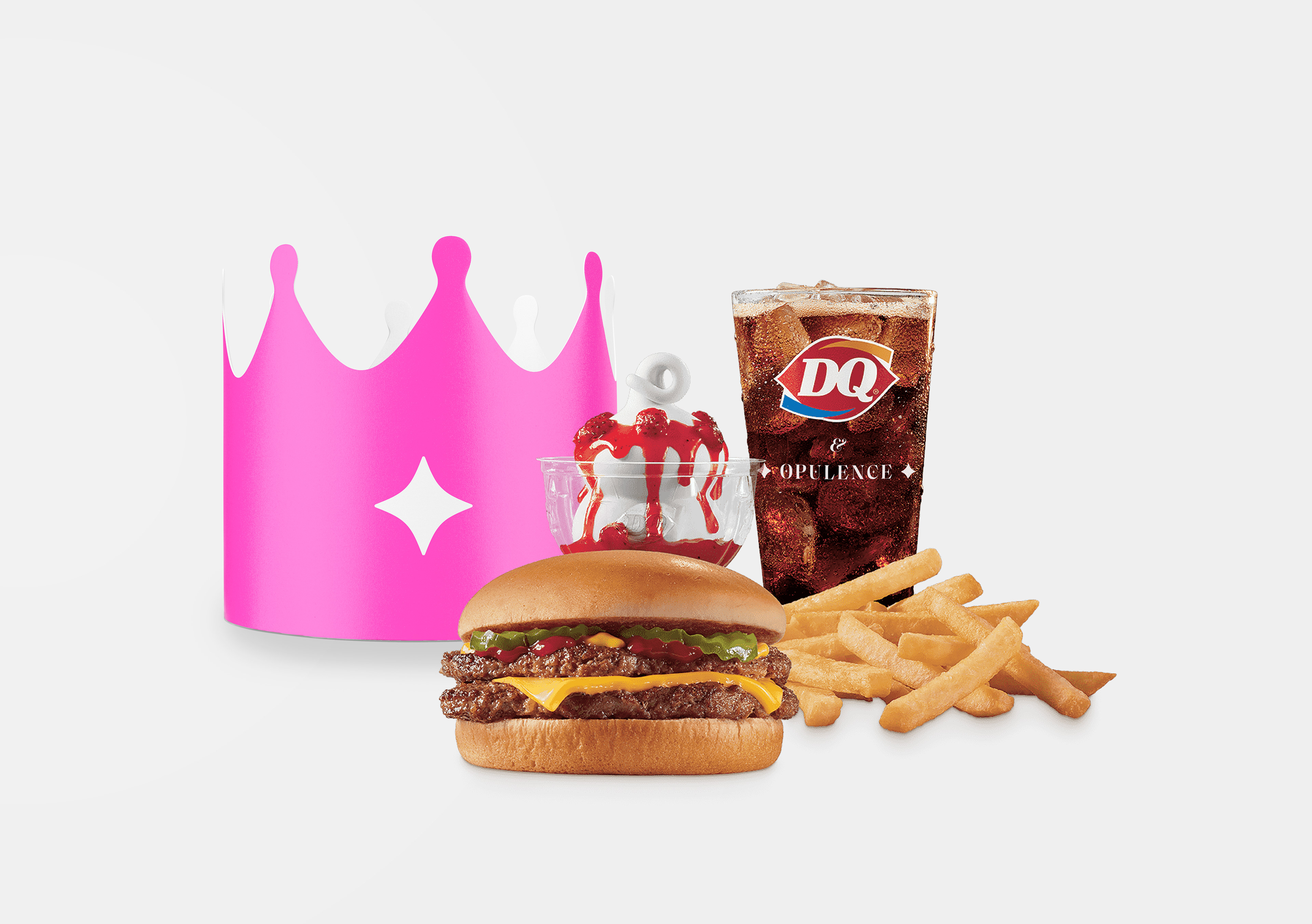
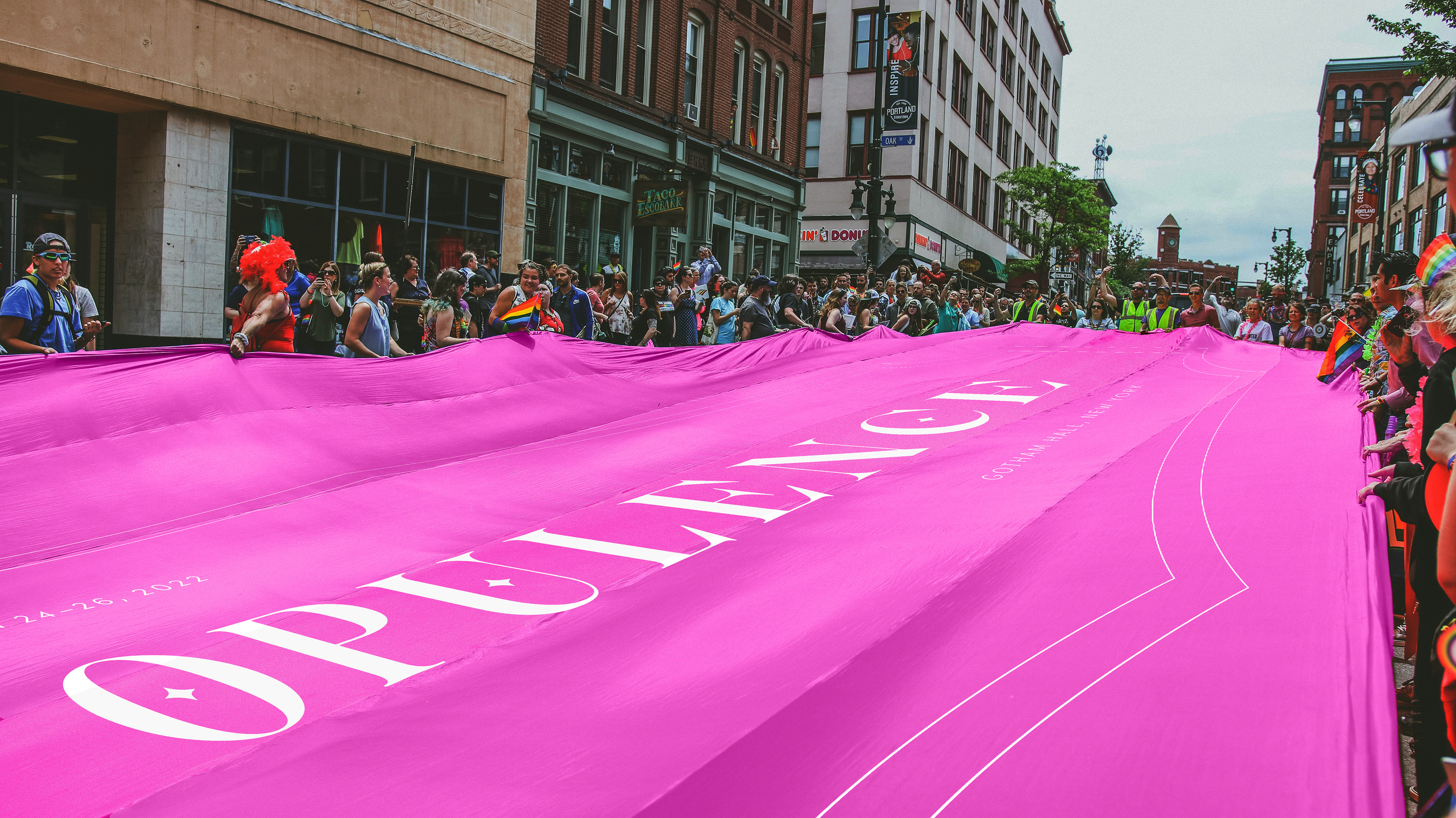
Our final conference proposal centers on a 3-day event at Gotham Hall in New York. Each day has its own theme: Who (a day for iconic speaker talks), What (a day for resources and workshops), & Wear (a day of live performance dressed in drag). Our values and personality traits including inclusivity, celebration, flamboyance, and inviting informed our visual system, color, type, and motifs. A guest critic pushed us beyond simply creating good design and instead to think out of the box and create unexpected ideas. Some of these ideas manifested as PR moments such as our Dairy Queen collaboration and Pride parade flag shown in the final solution.


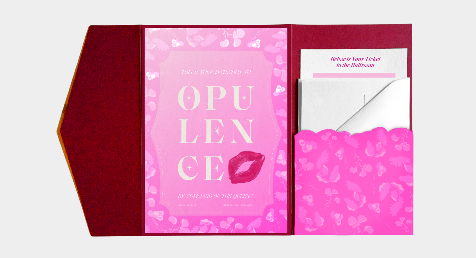
SOLUTION
PROMOTIONAL

At the Conference